Skip to content

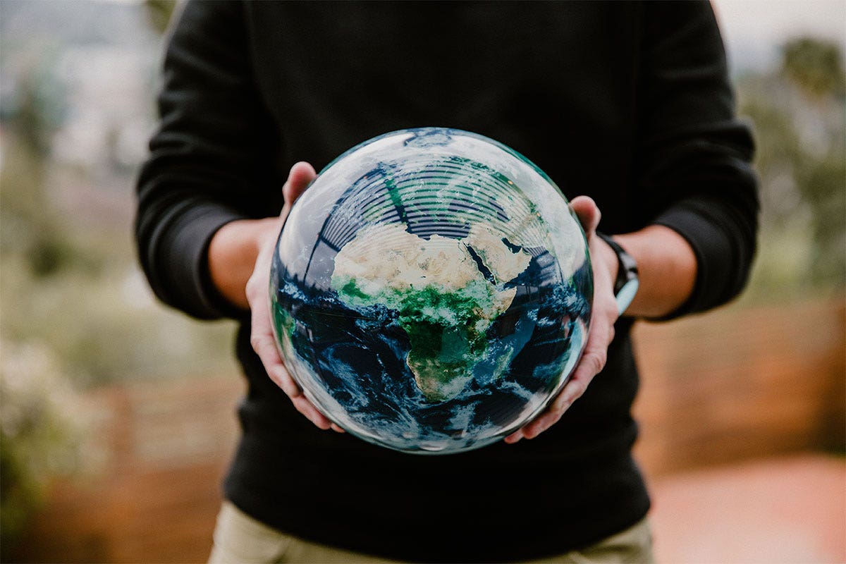
All maps lie. And all maps are wrong. As geographer Mark Monmonier says: ‘Lying with maps is not only easy, it is also important.’ Maps and globes, like speeches or paintings, are created by humans and are subject to distortions. These distortions can occur due to changes in scale, symbols, projection, simplification, and choices surrounding the map content. Monmonier continues: ‘To avoid hiding important information in a fog of details, the map must offer a selective, incomplete view of reality.’ This is the cartographic paradox: to convey a truthful image, a map must lie.
Saying that maps and globes are wrong is not meant to incite cynicism or distrust, but rather to foster a healthy sense of curiosity and critical thinking about what is shown to us on maps. Here we consider two ways in which maps and globes can be wrong: with political boundaries and other forms of altered representations of the Earth.
Political Boundaries
Political boundaries are one of the most common map controversies. It is rare for a map to explain the complexity of political boundaries, especially in contested areas. And the truth is that there are contested territorial boundaries in most countries of the Earth. Even the United States has disputed boundaries, including active disagreements with Canada, the Bahamas, Cuba, and Colombia. That is why maps are important and valuable – they represent claims of power and often reflect the interests of those who create them. Cartographer and author Denis Wood writes: ‘It’s not about whether the map is right or wrong (it’s not a question of accuracy), but that it takes a position while pretending to be neutral on an issue over which people are divided.’ Here are some examples of these divisions and maps that take a political stance.
Israel and Palestine
A space of deep division and disagreement is the territorial dispute over Israel and Palestine. At its core, it is about the dispute between two groups both vying for self-determination claiming the same land. The result is a complicated map of territorial claims that can seemingly change overnight and has yet to culminate in a definitive political map of the region. Propaganda maps abound, and other global actors, including other countries, play a closely intertwined role legitimizing and delegitimizing the claims of both pro-Israeli and pro-Palestinian interests. This includes external forces choosing to assign land rights to either Israel, only Palestine, or territorial claims of both parties. There is no map of the region that everyone can agree on.
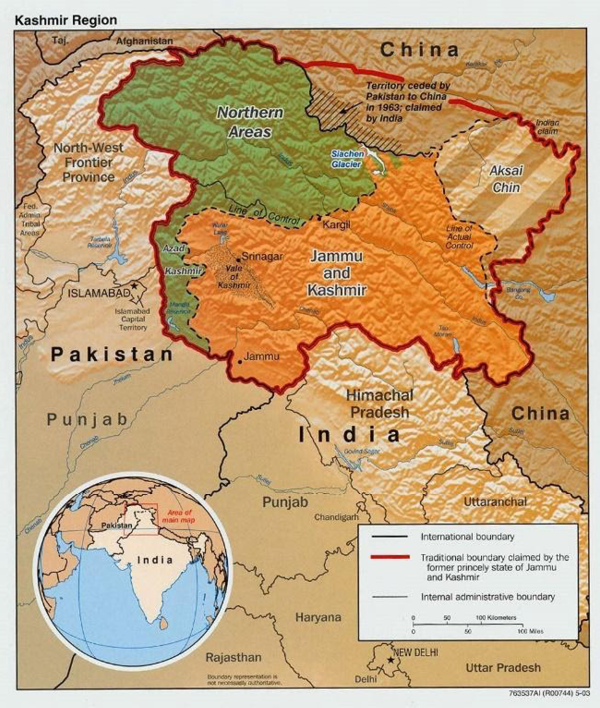
Kashmir Borders
A second heavily militarized and disputed border is Kashmir, which is simultaneously claimed by India and Pakistan, with additional complications from China. These contested claims make it notoriously difficult to accurately map the region. There is no consensus on current political boundaries, and even in areas where there is agreement, modern boundaries do not reflect the complex history of the region, the impacts of colonial interventions, or the distribution of various populations in the region. Where do we draw the lines when three different powers claim the same space?
Morocco and Western Sahara
Another confusing world boundary is the border of Morocco with Western Sahara. Typically, the dividing line between the two regions is marked with a dashed line, a true rarity on world maps and globes. What does this dashed line mean? The answer can vary depending on whom you speak to about the contested territory. The land is claimed by both Morocco and the stateless Polisario Front, an indigenous rights movement fighting for the independence of Western Sahara. Since 1991, there has been a United Nations-brokered ceasefire in the area until a referendum on independence takes place, which has yet to happen. Currently, Western Sahara is not self-governed, hence the dashed connection with neighboring Morocco – hesitantly claimed but effectively in a stalemate.
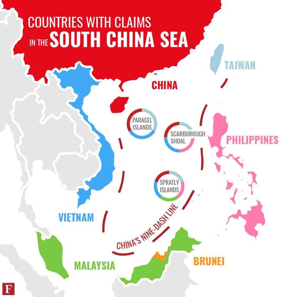
China’s Nine-Dash Line
China’s ‘Nine-Dash Line’, also known as ‘Cow Tongue’, in the South China Sea is also a potentially misleading dashed world boundary. Unlike the other boundaries discussed here, this dashed line extends into marine areas that are largely uninhabited and fluid. Although sparsely populated, this territorial claim contains important defense and natural resources and, controversially, disregards international agreements regarding what constitutes international waters. Tensions across the region are high, with frequent military patrols, exercises, and even confrontations with rivals. China’s claims in the South China Sea are not the only territorial dispute or the sole area of contested mapping but part of a pattern of superpower using maps to legitimize its claims in contested regions.
All World Maps are Wrong
Map Projections
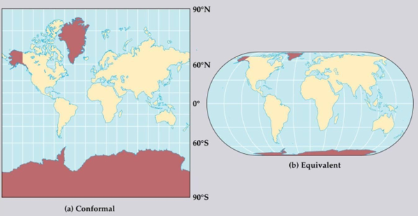
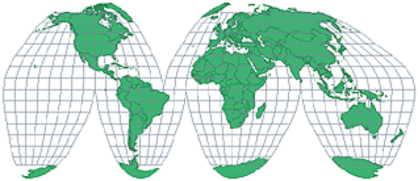
Problems with maps are not limited to conflicts over political boundaries. Maps also exhibit other inconsistencies. For example, every flat map faces the challenge of representing our spherical Earth as a two-dimensional object. This means that the mapmaker must use a projection, and different projections represent the Earth in slightly different ways. While some maps, such as conformal maps, can better preserve the exact shape of continents, other maps, such as equivalent maps, are better at maintaining accurate sizes of landmasses.
Look at Alaska, Antarctica, and Greenland in the maps above, for example. They change dramatically depending on the projection. On the conformal map, Greenland appears larger than the entire African continent. In reality, Africa is 13 times larger than Greenland! The equivalent map shows this size difference more accurately but also makes interpreting the shape of Greenland very difficult.
Some maps do both tasks well – but they usually have strange shapes, like the Goode Homolosine map. Continents have the correct shape and size, but now the oceans are split! All maps are forced to make decisions about what to focus on and what will inevitably be distorted.
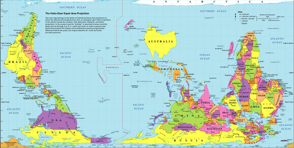
Eurocentric Map
How does it feel to see the world depicted below with continents in new places? Some of the earliest widely distributed maps came from European mapmakers, and thus Europe is not at the center by accident. This is not a coincidence but a conscious decision by those who created the maps.
North and South Poles
Whether map or globe: The decision to place the Northern Hemisphere (Europe, North Pole) at the top and the Southern Hemisphere (Australia, Antarctica) at the bottom is rarely questioned. What! But how could it be otherwise? Well, at the end of the day, planet Earth is just a sphere floating in space, and in our galaxy or the wider universe, there is no ‘up’, ‘down’, ‘north’, or ‘south’. The choice to place north or south where we usually see them is an arbitrary, not an absolute decision – and even playfully contested by some.
When it comes to representing the Earth on maps and globes, there are very few absolutes. All maps are created by people with different interests, and all maps inevitably distort, leave something out, and: yes, are a little wrong. It just depends on whom you ask.
BIO: Stacie A. Townsend, MA is a professor of geography at Los Angeles Mission College. She teaches courses in physical, cultural, and regional world geography. She is completing her PhD in geography at the University of California, Davis.